35. 做一个下载按钮的动画
简介
�我们在app的开发过程中经常会用到一些表示进度类的动画效果,比如一个下载按钮,我们希望按钮能够动态显示下载的进度,这样可以给用户一些直观的印象,那么在flutter中一个下载按钮的动画应该如何制作呢?
一起来看看吧。
定义下载的状态
我们在真正开发下载按钮之前,首先定义几个下载的状态,因为不同的下载状态导致的按钮展示样子也是不一样的,我们用下面的一个枚举类来设置按钮的下载状态:
enum DownloadStatus {
  notDownloaded,
  fetchingDownload,
  downloading,
  downloaded,
}
基本上有4个状态,分别是没有下载,准备下载但是还没有获取到下载的资源链接,获取到下载资源正在下载中,最后是下载完毕。
定义DownloadButton的属性
这里我们需要自定义一个DownloadButton组件,这个组件肯定是一个StatelessWidget,所有的状态信息都是由外部传入的。
我们需要根据下载状态来指定DownloadButton的样式,所以需要一个status属性。下载过程中还有一个下载的进度条,所以我们需要一个downloadProgress属性。
另外在点击下载按钮的时候会触发onDownload事件,下载过程中可以触发onCancel事件,下载完毕之后可以出发onOpen事件。
最后因为是一个动画组件,所以还需要一个动画的持续时间属性transitionDuration。
所以我们的DownloadButton需要下面一些属性:
class DownloadButton extends StatelessWidget {
  ...
  const DownloadButton({
    super.key,
    required this.status,
    this.downloadProgress = 0.0,
    required this.onDownload,
    required this.onCancel,
    required this.onOpen,
    this.transitionDuration = const Duration(milliseconds: 500),
  });
让DownloadButton的属性可以动态变化
上面提到了DownloadButton是一个StatelessWidget,所有的属性都是由外部传入的,但是对于一个动画的DownloadButton来说,status,downloadProgress这些信息都是会动态变化的,那么怎么才能让变化的属性传到DownloadButton中进行组件的重绘呢?
因为涉及到复杂的状态变化,所以简单的AnimatedWidget已经满足不了我们的需求了,这里就需要用到flutter中的AnimatedBuilder组件了。
AnimatedBuilder是AnimatedWidget的子类,它有两个必须的参数,分别是animation和builder。
其中animation是一个Listenable对象,它可以是Animation,ChangeNotifier或者等。
AnimatedBuilder会通过监听animation的变动情况,来重新构建builder中的��组件。buidler方法可以从animation中获取对应的变动属性。
这样我们创建一个Listenable的DownloadController对象,然后把DownloadButton用AnimatedBuilder封装起来,就可以实时监测到downloadStatus和downloadProgress的变化了。
如下所示:
Widget build(BuildContext context) {
    return Scaffold(
      appBar: AppBar(title: const Text('下载按钮')),
      body: Center(
        child: SizedBox(
          width: 96,
          child: AnimatedBuilder(
            animation: _downloadController,
            builder: (context, child) {
              return DownloadButton(
                status: _downloadController.downloadStatus,
                downloadProgress: _downloadController.progress,
                onDownload: _downloadController.startDownload,
                onCancel: _downloadController.stopDownload,
                onOpen: _downloadController.openDownload,
              );
            },
          ),
        ),
      ),
    );
  }
定义downloadController
downloadController是一个Listenable对象,这里我们让他实现ChangeNotifier接口,并且定义了两个获取下载状态和下载进度的方法,同时也定义了三个点击触发事件:
abstract class DownloadController implements ChangeNotifier  {
  DownloadStatus get downloadStatus;
  double get progress;

  void startDownload();
  void stopDownload();
  void openDownload();
}
接下来我们来实现这个抽象方法:
class MyDownloadController extends DownloadController
    with ChangeNotifier {
  MyDownloadController({
    DownloadStatus downloadStatus = DownloadStatus.notDownloaded,
    double progress = 0.0,
    required VoidCallback onOpenDownload,
  })  : _downloadStatus = downloadStatus,
        _progress = progress,
        _onOpenDownload = onOpenDownload;
startDownload,stopDownload这两个方法是跟下载状态和下载进度相关的,先看下stopDownload:
  void stopDownload() {
    if (_isDownloading) {
      _isDownloading = false;
      _downloadStatus = DownloadStatus.notDownloaded;
      _progress = 0.0;
      notifyListeners();
    }
  }
可以看到这个方法最后需要调用notifyListeners来通知AnimatedBuilder来进行组件的重绘。
startDownload方法会复杂一点,我们需要模拟下载状态的变化和进度的变化,如下所示:
  Future<void> _doDownload() async {
    _isDownloading = true;
    _downloadStatus = DownloadStatus.fetchingDownload;
    notifyListeners();

    // fetch耗时1秒钟
    await Future<void>.delayed(const Duration(seconds: 1));

    if (!_isDownloading) {
      return;
    }

    // 转换到下载的状态
    _downloadStatus = DownloadStatus.downloading;
    notifyListeners();

    const downloadProgressStops = [0.0, 0.15, 0.45, 0.8, 1.0];
    for (final progress in downloadProgressStops) {
      await Future<void>.delayed(const Duration(seconds: 1));
      if (!_isDownloading) {
        return;
      }
      //更新progress
      _progress = progress;
      notifyListeners();
    }

    await Future<void>.delayed(const Duration(seconds: 1));
    if (!_isDownloading) {
      return;
    }
    //切换到下载完毕状态
    _downloadStatus = DownloadStatus.downloaded;
    _isDownloading = false;
    notifyListeners();
  }
}
因为下载是一个比较长的过程,所以这里用的是异步方法,在异步方法中进行通知。
定义DownloadButton的细节
有了可以动态变化的状态和进度之后,我们就可以在DownloadButton中构建具体的页面展示了。
在未开始下载之前,我们希望downloadButton是一个长条形的按钮,按钮上的文字显示GET,下载过程中希望是一个类似CircularProgressIndicator的动画,可以根据下载进度来动态变化。
同时,在下载过程中,我们希望能够隐藏之前的长条形按钮。 下载完毕之后,再次展示长条形按钮,这时候按钮上的文字显示为OPEN。
因为动画比较复杂,所以我们将动画组件分成两部分,第一部分就是展示和隐藏长条形的按钮,这里我们使用AnimatedOpacity来实现文字的淡入淡出的效果,并将AnimatedOpacity封装在AnimatedContainer中,实现decoration的动画效果:
  return AnimatedContainer(
      duration: transitionDuration,
      curve: Curves.ease,
      width: double.infinity,
      decoration: shape,
      child: Padding(
        padding: const EdgeInsets.symmetric(vertical: 6),
        child: AnimatedOpacity(
          duration: transitionDuration,
          opacity: isDownloading || isFetching ? 0.0 : 1.0,
          curve: Curves.ease,
          child: Text(
            isDownloaded ? 'OPEN' : 'GET',
            textAlign: TextAlign.center,
            style: Theme.of(context).textTheme.button?.copyWith(
              fontWeight: FontWeight.bold,
              color: CupertinoColors.activeBlue,
            ),
          ),
        ),
      ),
    );
实现效果如下所示:
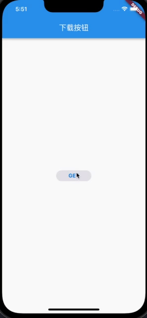
接下来再处理CircularProgressIndicator的部分:
 Widget build(BuildContext context) {
    return AspectRatio(
      aspectRatio: 1,
      child: TweenAnimationBuilder<double>(
        tween: Tween(begin: 0, end: downloadProgress),
        duration: const Duration(milliseconds: 200),
        builder: (context, progress, child) {
          return CircularProgressIndicator(
            backgroundColor: isDownloading
                ? CupertinoColors.lightBackgroundGray
                : Colors.white.withOpacity(0),
            valueColor: AlwaysStoppedAnimation(isFetching
                ? CupertinoColors.lightBackgroundGray
                : CupertinoColors.activeBlue),
            strokeWidth: 2,
            value: isFetching ? null : progress,
          );
        },
      ),
    );
  }
这里使用的是TweenAnimationBuilder来实现CircularProgressIndicator根据不同progress的动画效果。
因为在下载过程中,还有停止的功能,所以我们在CircularProgressIndicator上再放一个stop icon,最后将这个stack封装在AnimatedOpacity中,实现整体的一个淡入淡出功能:
         Positioned.fill(
            child: AnimatedOpacity(
              duration: transitionDuration,
              opacity: _isDownloading || _isFetching ? 1.0 : 0.0,
              curve: Curves.ease,
              child: Stack(
                alignment: Alignment.center,
                children: [
                  ProgressIndicatorWidget(
                    downloadProgress: downloadProgress,
                    isDownloading: _isDownloading,
                    isFetching: _isFetching,
                  ),
                  if (_isDownloading)
                    const Icon(
                      Icons.stop,
                      size: 14,
                      color: CupertinoColors.activeBlue,
                    ),
                ],
              ),
            ),
总结
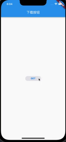
这样,我们一个动画的下载按钮就制作完成了,效果如下:
�点我查看更多精彩内容:www.flydean.com